Scope
Designing the product showcase catalogue for the Manifest collection
Structuring hero spreads, editorial storytelling and SKU-based layouts
Elevating existing jewellery imagery for premium presentation
Role
Generated AI-based podiums, props and staging elements
Designed full layout grids, flow, and catalogue sequencing
Worked collaboratively with agency team
Overview
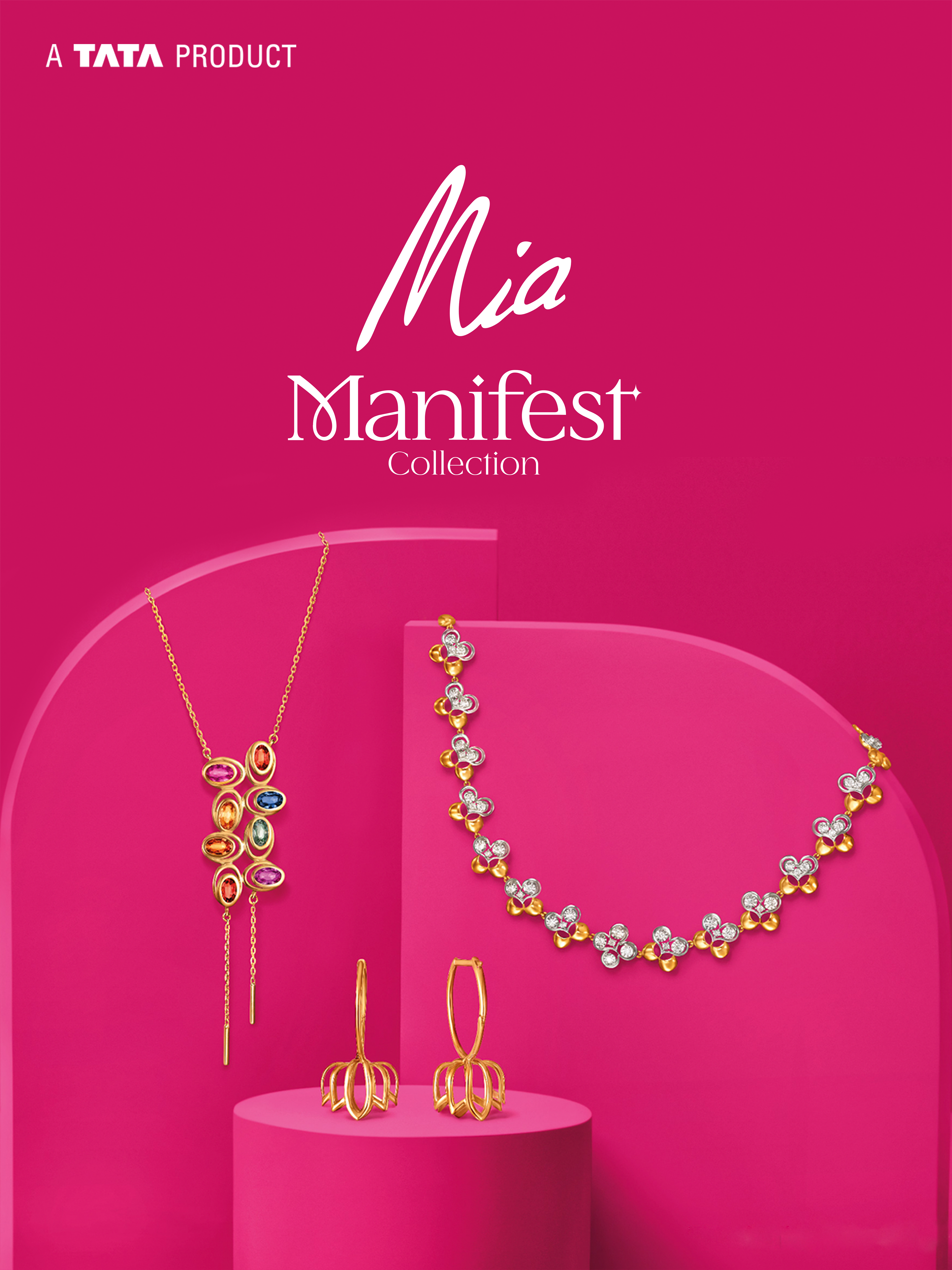
The Manifest Collection Catalogue was created for Mia by Tanishq, in collaboration with the marketing agency Chalk & Chini. The project involved designing a visual catalogue that showcases Mia’s festive line, positioned as a matured and trend-conscious direction for the brand. While product images and brand colours were supplied by the client, the complete catalogue execution—from visual styling to layout design—was undertaken as part of the project.
The outcome was a multi-page catalogue that brings to life Mia’s identity of youthful elegance, while elevating the products into a premium editorial presentation.
Design Intent
The design intent revolved around three key objectives:
Elevate the jewellery without traditional studio backgrounds
Align the catalogue with Mia’s modern, everyday-luxury positioning
Create a visual system that remains consistent across diverse SKUs
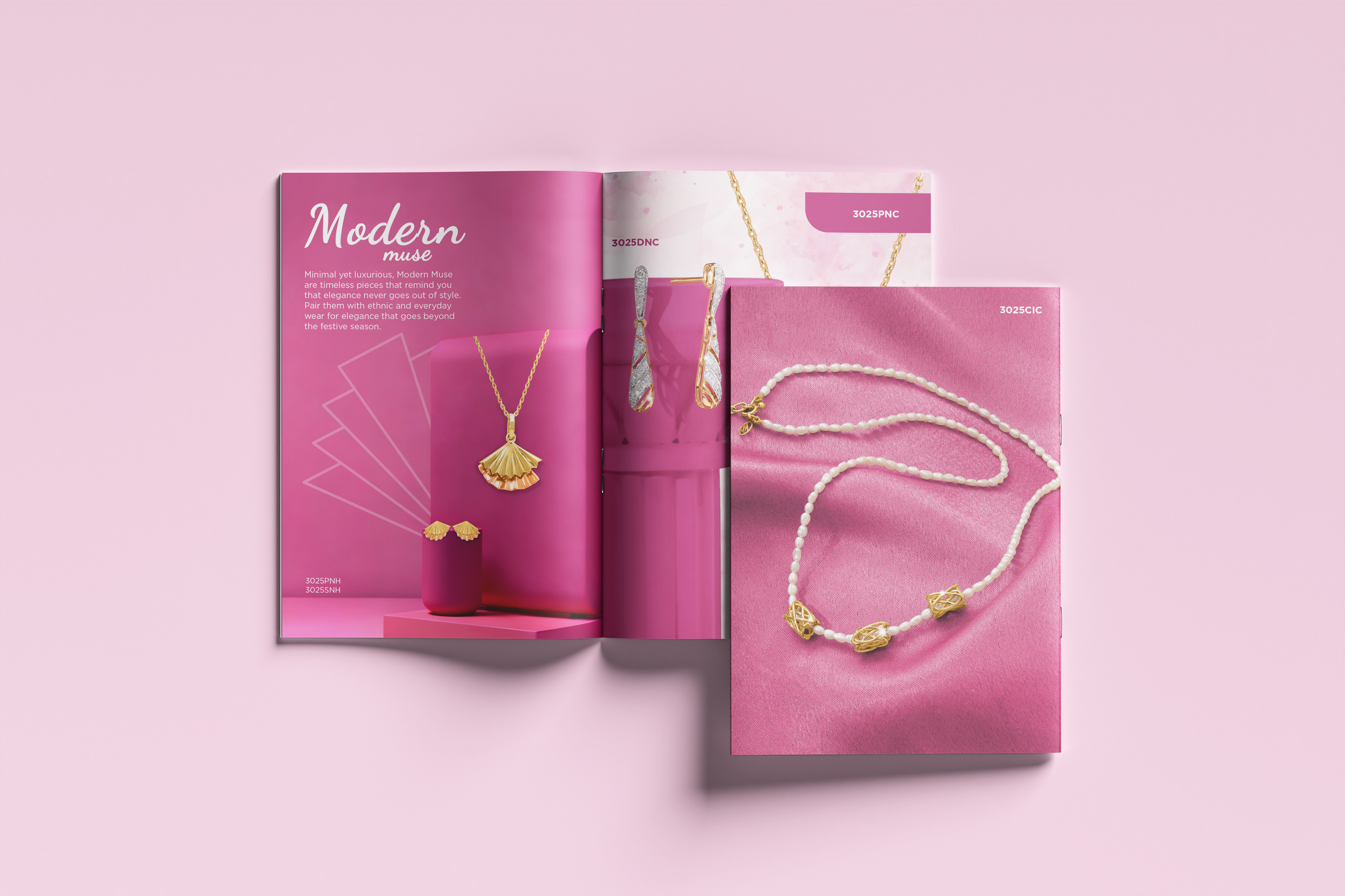
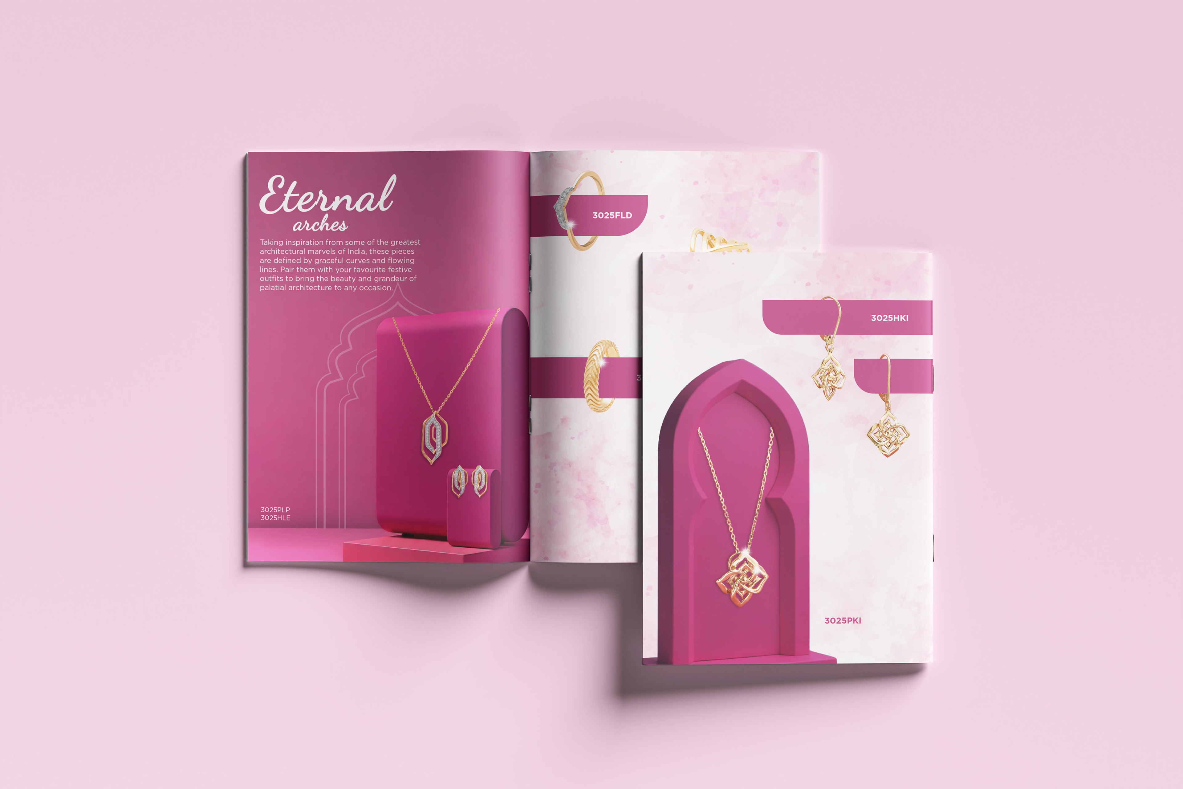
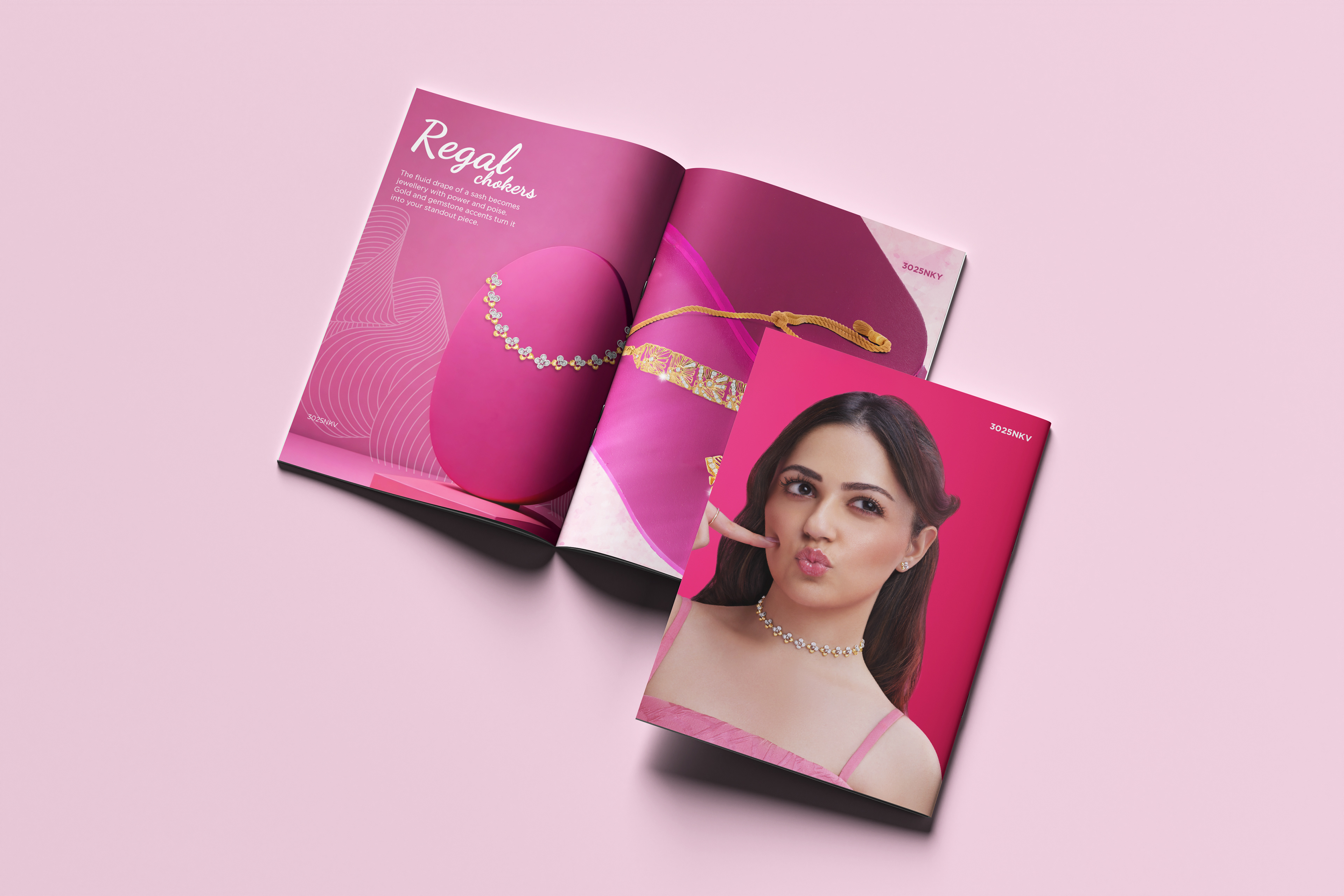
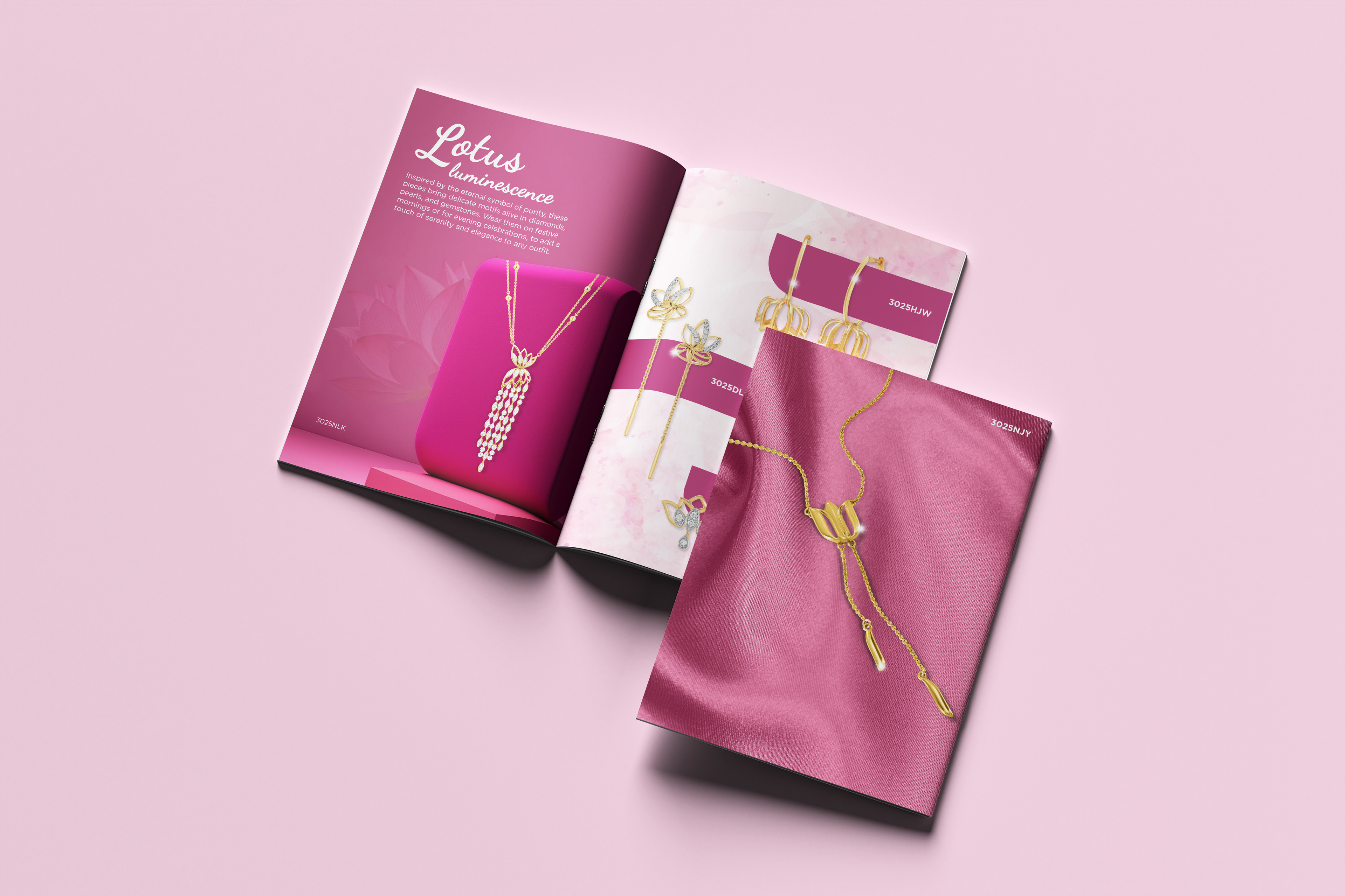
The underlying narrative built around the word Manifest rooted in aspiration, confidence, and a celebratory femininity. The aim was to present each piece not as an accessory, but as a reminder of intentional choices and everyday luxury.
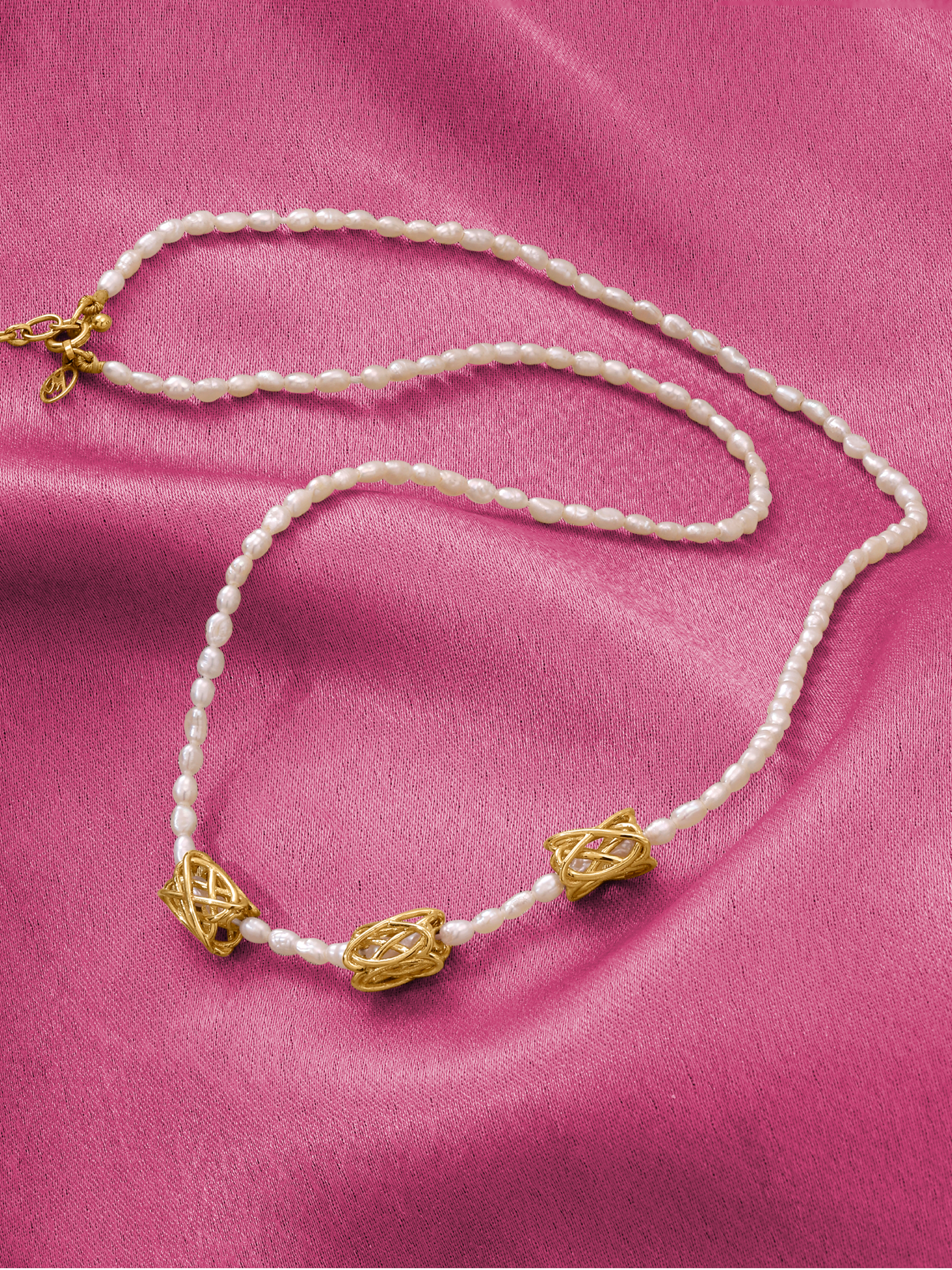
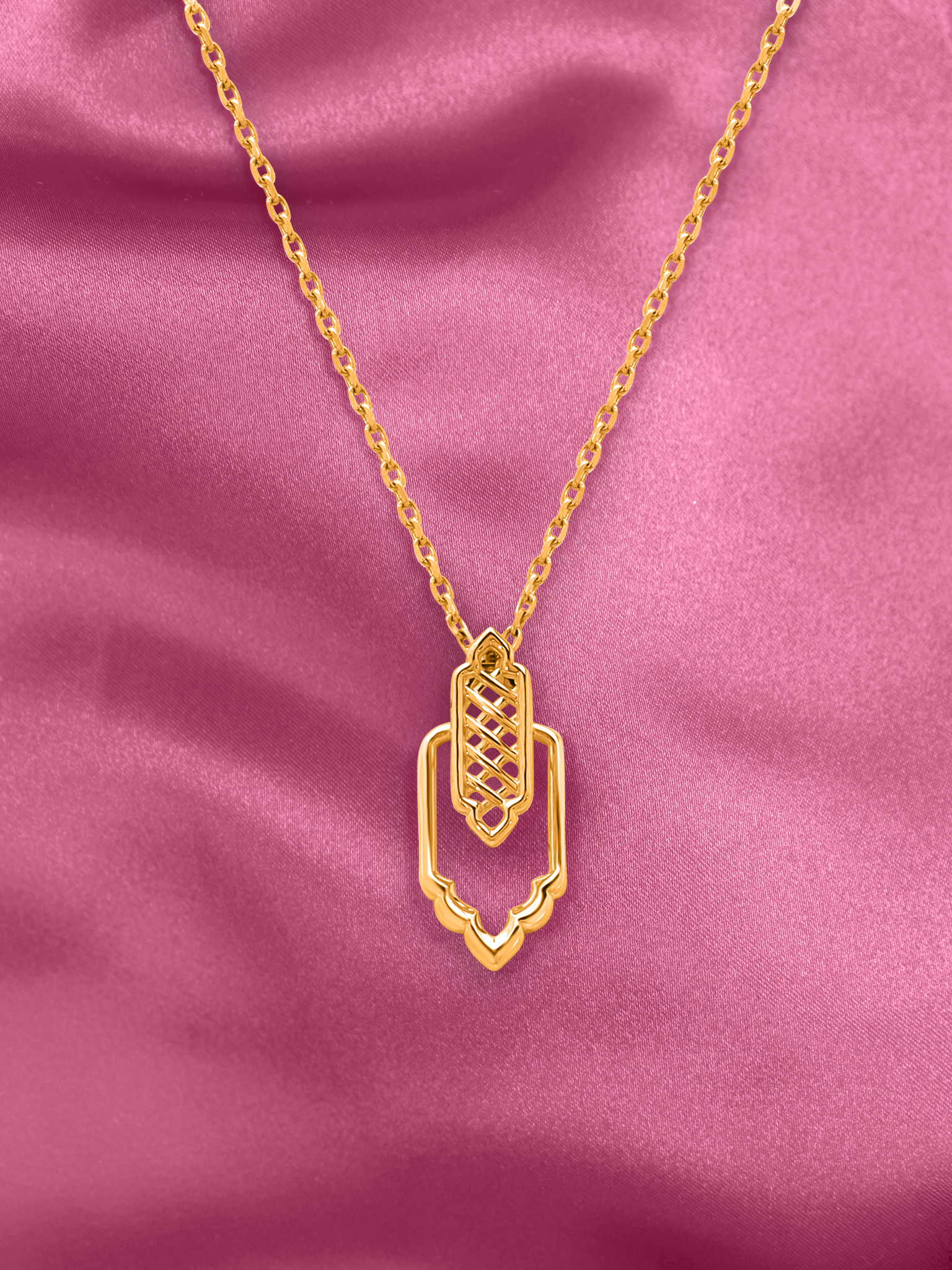
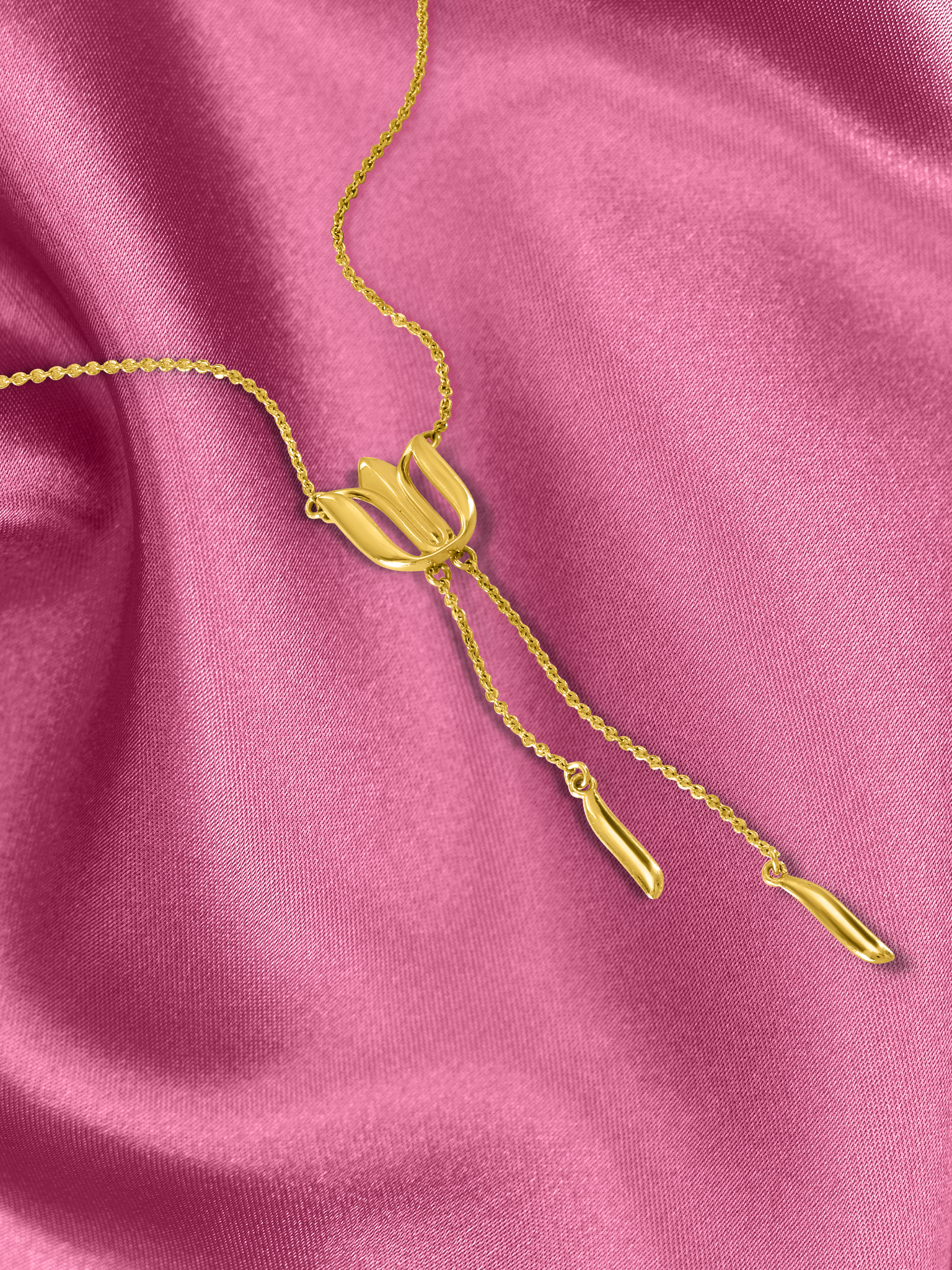
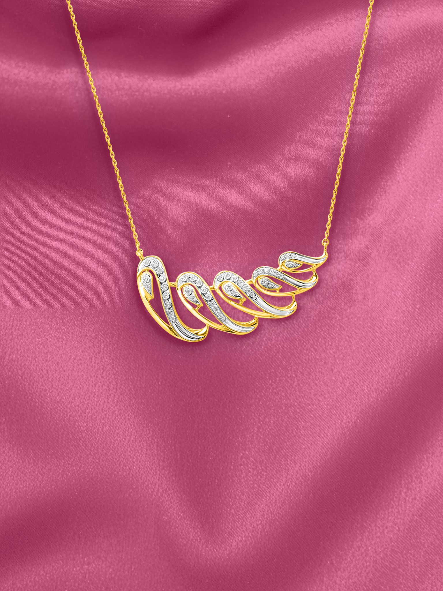
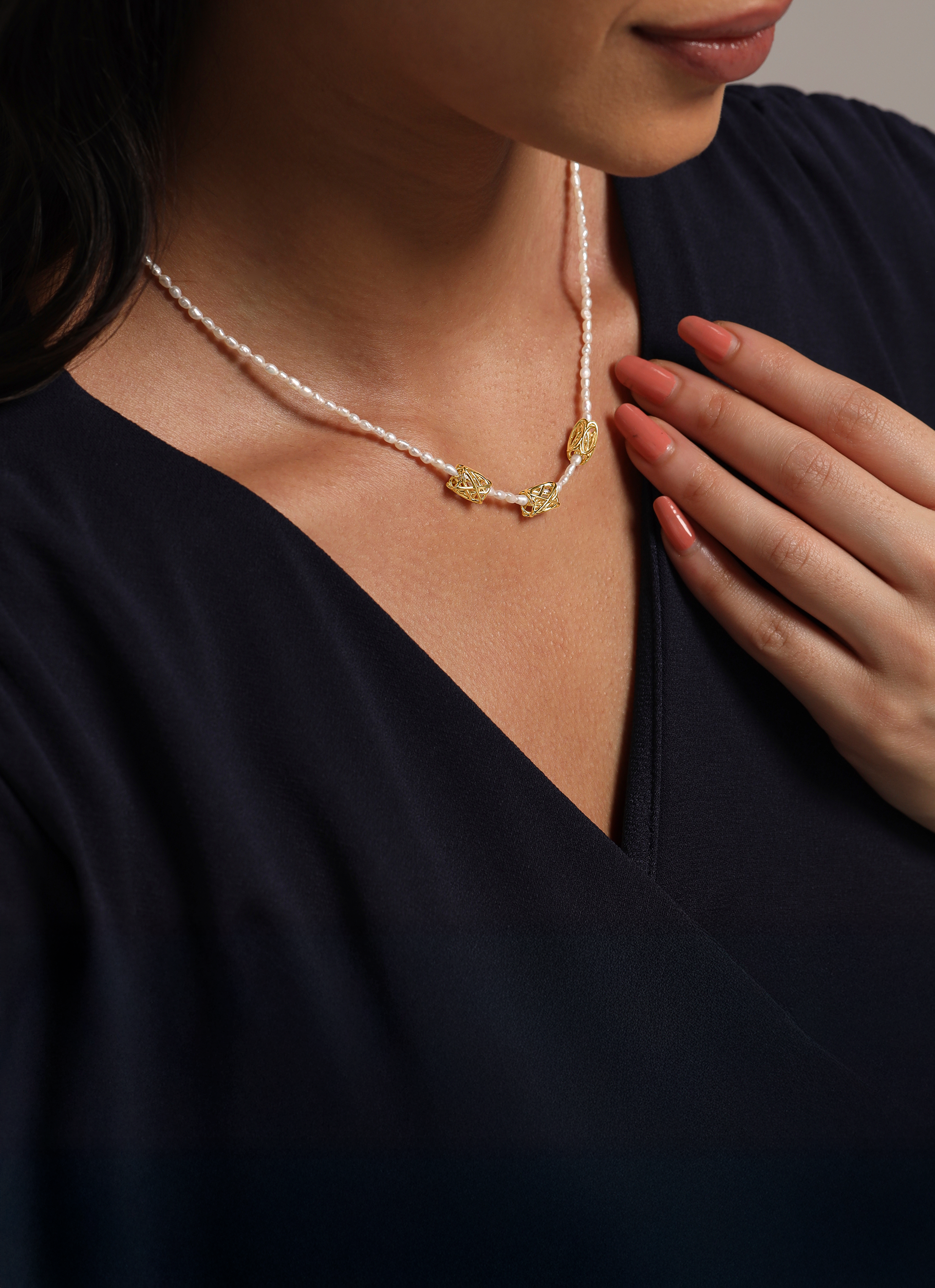
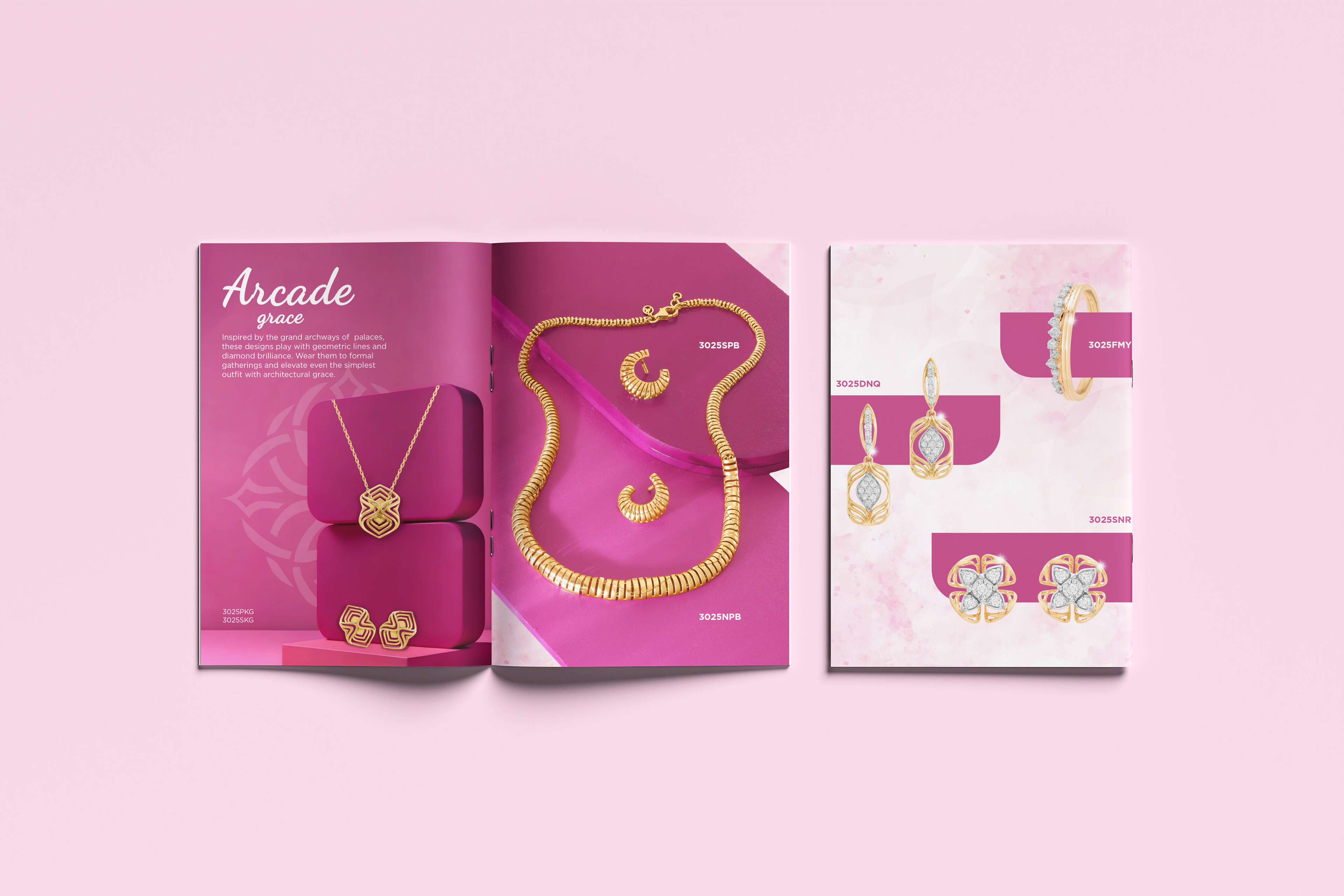
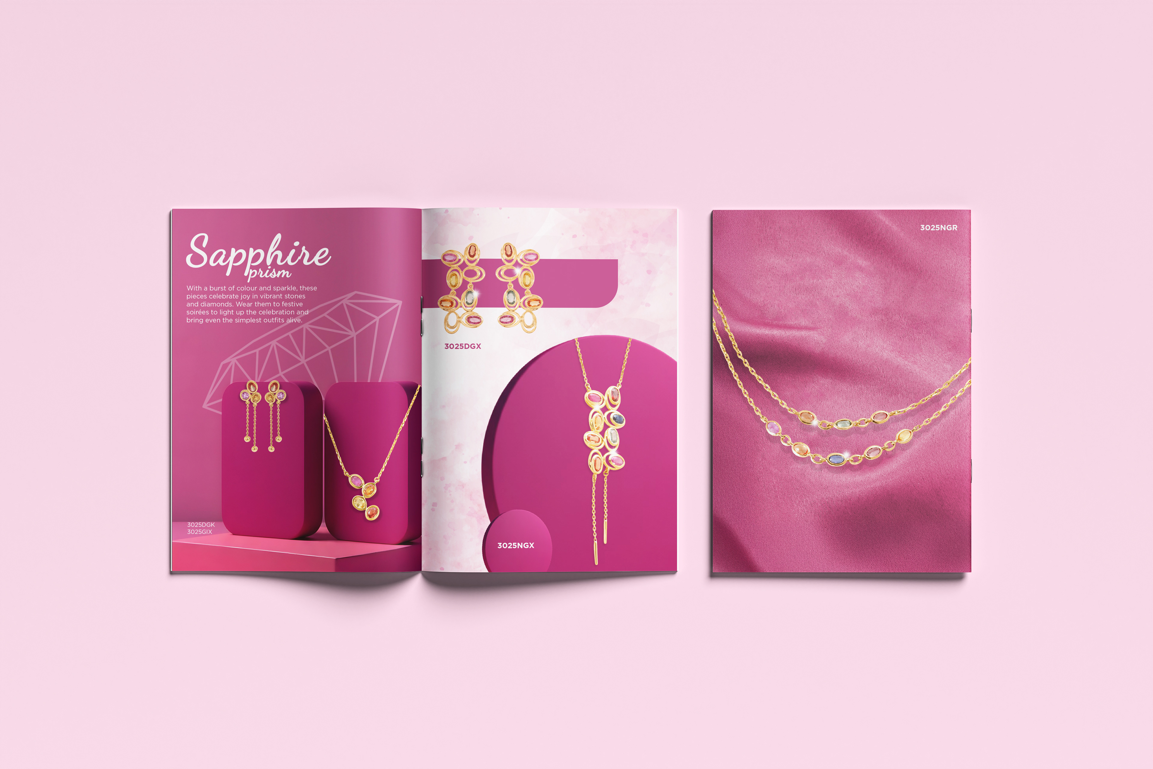
Visual Styling & Image Development
Since available product imagery was delivered as isolated cut-outs, a core part of the project was to design refined display environments for each SKU.
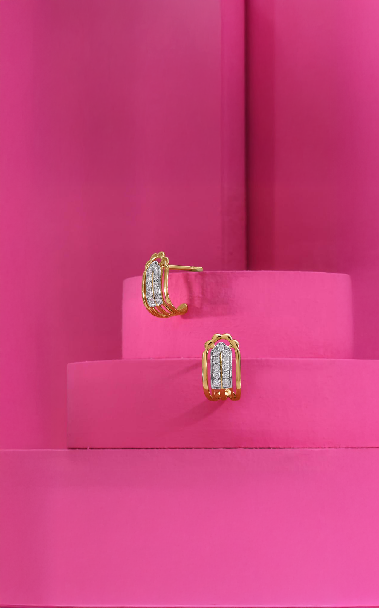
AI-Generated Props & Surfaces
To achieve this:
AI-generated plinths, arch-shaped podiums, curved cubes, and textured blocks were created
Highlights, shadows, reflections, and sparkle accents were enhanced for realism
Examples:
Rounded plinths for statement chokers
Arched forms echoing Indian architectural silhouettes
Soft organic folds for necklace drapes
These props unified the diverse pieces under one consistent visual umbrella.
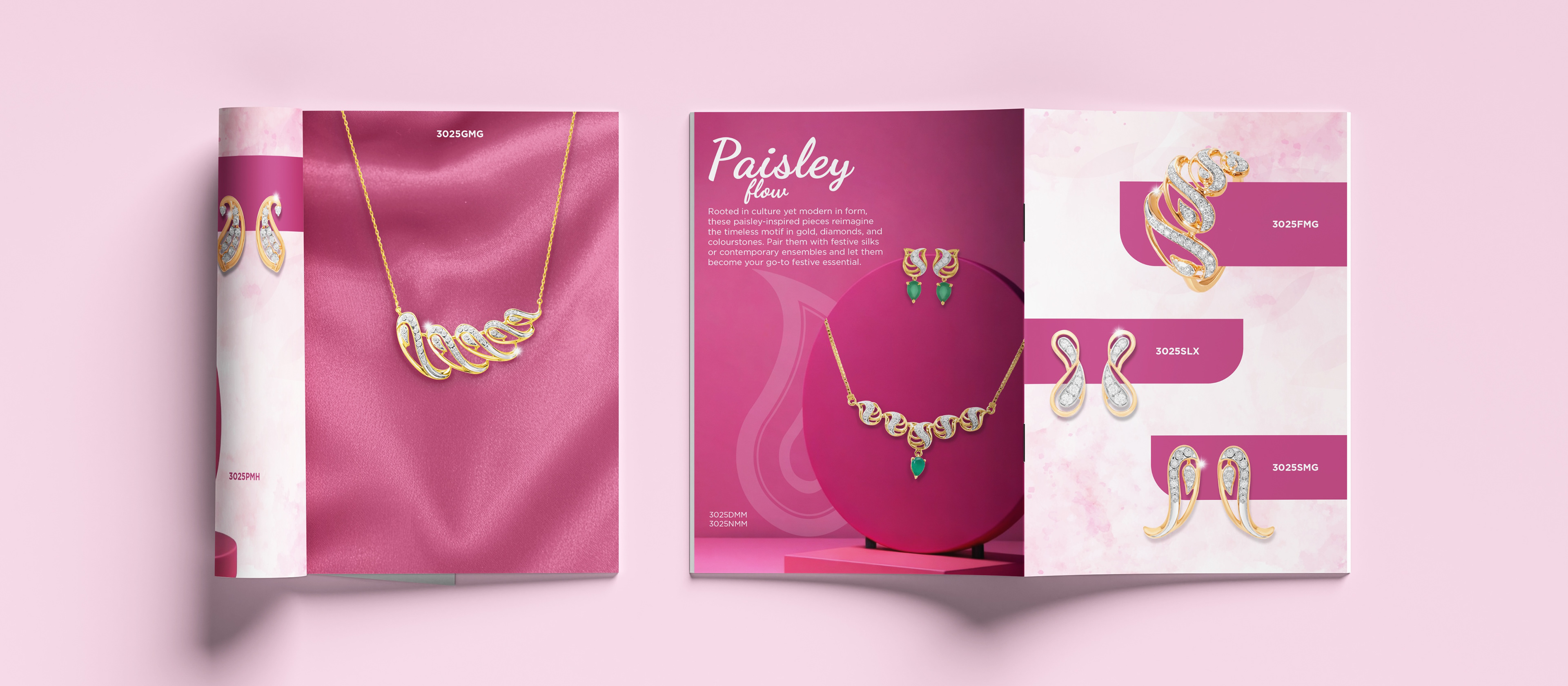
Layout & Typography Approach
The catalogue was structured to be visually breathable and editorially clean.
Key decisions included—
Clear SKU placements with consistent naming placement
Generous negative spacing to let gemstones and gold surfaces shine
Hero pages introducing story chapters such as Sapphire Prism
Minimal type styling to keep jewellery as the focal point
Colour System
The colour palette followed the base tone provided by the brand—a deep magenta-pink, elevated across gradients, velvet textures, and matte finishes.
Pink tones served three roles:
Brand-consistent foundation
Soft feminine appeal without being juvenile
Contrast that amplified gold and gemstone tones
Paired with off-white text areas, it created a strong visual identity across pages.
Technical Approach
Vector-based motifs ensure scalability for large walls
Repeats constructed with precision for seamless installation
Mockups created to understand spatial impact and interior compatibility
Adjustable colour-ways made for each design to increase commercial flexibility
Balance of negative space to ensure designs feel breathable on real walls
Outcome
The resulting collection presents a cohesive range of wallpapers that comfortably transition between classic and contemporary interiors, offering both minimal expressions and ornamental richness.
Each design captures graceful botanicals and refined motif structures, translated into subtle palettes that feel modern and universally adaptable. The work sits at the intersection of heritage sensibilities and current interior preferences—balancing storytelling with usability, depth with softness, and pattern presence with spatial calm—making the collection suitable for homes across diverse design aesthetics.